Responsive web design, dynamic scaling, or css3 media-queries work wonders in the wordpress twentyeleven-theme… But the navigation-menus are forgotten.
To accommodate menus from wide-resolutions on mobile devices designers re-word, re-size, and re-think even using responsive web design. Instead of trying to adapt a whole menu to a smaller screen…
Why not replace that menu with a different one?

This tutorial explains how to create additional navigation-menus in your WordPress theme & how to make those menus replace one and other using css3 media queries, so you can have a different menu arrangement for wide-screen than mobile.
We originally used a WordPress twentyeleven-theme for this tutorial. But you can do this on almost any theme that supports media-queries.
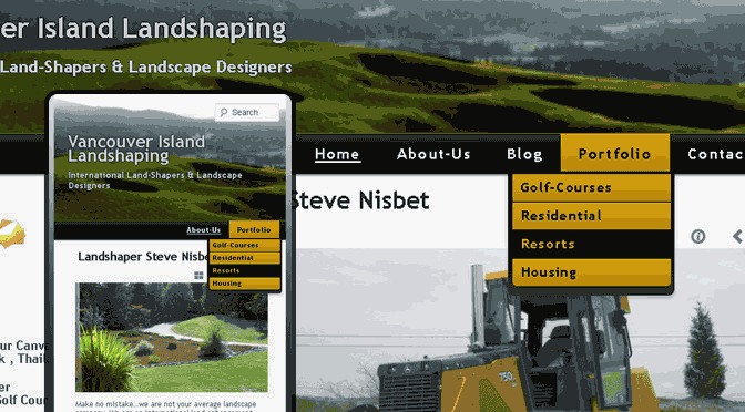
Yes this plays nice with the jQuery menu in TwentyTwelve… For the most-part. TwentyTwelve Scales-Up, TwentyEleven Scales-Down.
1.) In your themes functions.php-file add the following (down at the bottom will be fine)
function dabzo_register_my_menus() {
 register_nav_menus(
 array(
 'primary' => __( 'Primary Menu' ),
 'mobile' => __( 'Mobile Menu' )
 )
 );
 }
 add_action( 'init', 'dabzo_register_my_menus' );
2.) In your header.php-file… replace ::
'primary' ) ); ?>
With this ::
 'primary', 'menu_class' => 'nav-menu primary-menu' ) ); ?>
  'mobile', 'menu_class' => 'nav-menu mobile-menu' ) ); ?>
3.) The fun-part…
The Key to Responsive Web Design: CSS-3 Media-Queries
In your style.css-file replace this ::
@media (max-width: 650px) {
 /* Reduce font-sizes for better readability on smaller devices */
With this ::
/* The primary rules should be declared outside of any media-query closures */
 .primary-menu{display:inline-block;}
 .mobile-menu{display:none;}
@media (max-width: 650px) {
/* Reduce font-sizes for better readability on smaller devices and toggle our primary_nav to mobile_nav */
.primary-menu{display:none;}
.mobile-menu{display:inline-block;}
/* max-width: 650px rules continue below... */
Be sure to get familiar with css3-media queries (They heard we liked style-sheets, so they put style-sheets in our style-sheets… So we can script-styles while we script-styles)
Now when you visit the ‘Appearance’ >> ‘Menus’ area of wp-admin you will have two separate menus to configure. One menu (our primary_navigation) will appear on screens / browsers wider than 650px and the ‘mobile_navigation’ will take over on screens smaller than 650px wide.
This is not The Only way to do this, or even The Best way to do this. I am confident that this approach will get many people out of many binds.
We could stack all of the links in our navigation menu on top of each other by giving them (and their parent list-item elements) a width-property of 100%.
Alternatively we could use jQuery to convert our unordered-list & list-item navigation structure to a select & option navigation structure or some other drop-down / accordion interface.
One could use a browser-side solution such-as enquire.js to use media-queries, even in browsers that do not support media-queries.
Responsive Menus for WordPress Membership Sites
You may want to have separate menus for users who are logged-in and those who are logged-out. To do that you can use the following ::
Add this to functions.php
function dabzo_register_my_menus() {
 register_nav_menus(
 array(
 'primary' => __( 'Primary Menu' ),
 'mobile' => __( 'Mobile Menu' ),
 'member-primary' => __( 'Member Primary Menu' ),
 'member-mobile' => __( 'Member Mobile Menu' )
 )
 );
 }
 add_action( 'init', 'dabzo_register_my_menus' );
In header.php replace this:
'primary' ) ); ?>
With this:
  'member-primary', 'menu_class' => 'nav-menu primary-menu' ) ); ?>
  'member-mobile', 'menu_class' => 'nav-menu mobile-menu' ) ); ?>

  'primary', 'menu_class' => 'nav-menu primary-menu' ) ); ?>
  'mobile', 'menu_class' => 'nav-menu mobile-menu' ) ); ?>
Don’t forget to add the break-point in style.css ::
Replace this ::
@media (max-width: 650px) {
With this ::
/* The primary rules should be declared outside of any media-query closures */
.primary-menu{width:auto;height:auto;}
.mobile-menu{width:auto;height:auto;display:none;}
@media (max-width: 650px) {
/* Reduce font-sizes for better readability on smaller devices and toggle our primary_nav to mobile_nav */
.primary-menu{display:none;}
.mobile-menu{display:block;}
/* max-width: 650px rules continue below... */
There you have it. We now have separate menus on the Appearance>>Menus-page in wp-admin and can count on one to replace the other when the view-port is less than 650px (650 pixels) wide.
Another technique you could try is to use some jQuery to turn the existing navigation in to an select-element / option list dialogue and use enquire.js to toggle it.
 jQuery(document).ready(function(){
 enquire.register("screen and (max-width:600px)", {
 // If supplied, triggered when a media query matches.
 deferSetup : true,
 setup : function(){
 $(function() {
 // Create the dropdown base
 $("
").prependTo("header#masthead");
// Create default option "Go to..."
$("", {
"selected": "selected",
"value" : "",
"text" : "Navigation..."
}).appendTo("header#masthead select");
// Populate dropdown with menu items
$("nav a:gt(1)").each(function() {
var el = $(this);
$("", {
"value" : el.attr("href"),
"text" : el.text()
}).appendTo("header#masthead select");
});
// To make dropdown actually work
// To make more unobtrusive: http://css-tricks.com/4064-unobtrusive-page-changer/
$("header#masthead select").change(function() {
window.location = $(this).find("option:selected").val();
});
});
},
match : function() {
$(function() {
//$('.menu-primary-navigation-container').css('display','none');
$('#dropnav').css('display','block');
});
},
unmatch : function() {
$(function() {
//$('.menu-primary-navigation-container').css('display','block');
$('#dropnav').css('display','none');
});
}
});
});
One Query Only
So far this technique involves two separate wordpress menus… Two separate database queries… If you want to make it faster consider the following:
Most WordPress instals are using a caching plugin of some sort anyway & having the separate nav-menus in the admin area is more manageable – but hey, if you feel like it there’s the above option.